

 Image styles
The image styles feature lets you adjust the appearance of images. It works by applying CSS classes to images or changing their type from inline to block or vice versa.
# Overview
This package allows for adjusting the image appearance by:
- Applying CSS classes – Adding a particular predefined or custom CSS class or removing any style-related CSS class.
- Managing the HTML representation by changing the image type from inline to block and vice versa. Applying a style may change the type of the image, depending on the configuration of the style.
The actual styling of the images is the job of the integrator. CKEditor 5 WYSIWYG editor comes with some default styles, but they will only be applied to the images inside the editor. The integrator needs to style them appropriately on the target pages.
You can find the source of the default styles applied by the editor here: ckeditor5-image/theme/imagestyle.css.
Read more about styling the content of the editor.
# Image classes
The styles applied to the image can either add the style-related class or remove it. This behavior depends on the particular configuration of the ImageStyleOptionDefinition. Only the definition with the isDefault flag set to true will remove any applied image style-related class.
The ImageStyle plugin does not provide any mechanism to apply a default CSS class to newly inserted images. The integrator should handle the initial image appearance by defining the proper custom content styles. If desired, the default image appearance customization can be done by overriding the following CSS rules:
.ck-content .image-inlinefor the inline images,.ck-content .imagefor the block images.
# Inline and block images
You can display images in the editor as either inline or block.
The inline-type images are represented as inline HTML elements. You can insert them in the middle of a paragraph or in a link just like regular text. The HTML representation of the inline image looks like this:
<span class=”image-style-class”><img></img></span>in the editable.<img class=”image-style-class”></img>in the HTML content retrieved by thegetData()method.
Block-type images can be inserted only between other blocks like paragraphs, tables, or media. The HTML representation of the block image looks like this:
<figure class=”image image-style-class”><img></img></figure>.
Switching between these two types of images can be executed by applying or removing a style from the image. Each of the defined style options provides a list of the image types that it can apply to. Applying a style may change the type of the image, depending on the configuration of the style.
When you insert a new image, the editor will, by default, choose the optimal image type based on the context of the insertion (for example, the current selection/position and availability of plugins). You can control the default type of the newly inserted image using the image.insert.type configuration.
All the default editor builds support both block and inline images, but it is also possible to disable one of these types.
# UI
You can apply a style by using one of the toolbar buttons created by the ImageStyle plugin. Each of the defined styles (both default and custom) will be registered under the name imageStyle:image-style-name in the ComponentFactory. You can then add it to the image or main toolbar by referencing this name.
The default image toolbar has its standard configuration already set in the predefined builds.
- The default UI of the classic, inline, balloon, and balloon block builds consists of a set of buttons to apply the semantical styles to support creating structured content. See a live example.
- The document editor build UI uses several buttons for applying presentational styles and also uses the semantical styles to reset the image appearance to default. See a live example.
You can also create a completely custom image styles UI, setting your icons and tooltips, and grouping the image style buttons into custom dropdowns. Read more about it in the configuring the styles section of this guide.
# Approaches to styling images
CKEditor 5 offers two basic approaches to styling the images:
- A particular style can define the image type, so you can style it, for example, as an avatar, a banner, or an emoticon. It will be called a “semantical style” since it refers to the purpose of the particular image.
- Sometimes the user should be able to granularly control how an image is presented thanks to the ability to set the size and alignment separately and completely arbitrarily. The style that defines the image alignment will be called a “presentational” one since it refers to the appearance of the image.
The distinction made above is purely theoretical. Setting up both semantical and presentational styles happens in the same way, using the ImageConfig#styles configuration.
# Semantical styles
A semantical style lets the user choose from predefined appearances of the images. The user is not able to set the image border, alignment, margins, width, etc. separately. Instead, they can pick one of the styles defined by the developer who prepared the WYSIWYG editor integration. Check the list of the available semantical styles in the table below. Semantical styles give the integrator the ability to put a wide range of predefined image appearances at the user’s disposal. This gives the developer control over how the users style their images and makes the user’s life easier by setting many properties at once.
Try to understand what use cases your system needs to support and define semantic options accordingly. Defining useful and clear styles is one of the steps toward a good user experience and clear, portable output. The “side image” in the example below is displayed as a floated image on wide screens and as a normal image on low-resolution screens (for example, mobile browsers).
While you can combine semantical styles with manual image resizing, these features were not designed to be used together. Semantical styles usually also affect the image size.
If you want to enable image resizing, use presentational image styles instead. You can also define custom semantical styles to make sure that there are no conflicts with the image resizing feature.
Most of the predefined editor builds support editing structured content. This requires passing the control over the possible image appearances to the developer. The predefined builds thus introduce a UI containing a set of buttons applying the semantical styles (taken from the default styles listed below).
The example below shows an editor with such a basic configuration. There are three types of images:
- A block image
 – A representation of a block image with no style-related CSS class.
 - An inline image
 – A representation of an inline image with no style-related CSS class.
 - A side image
 – A semantical style with the
 image-style-sideCSS class applied to it
You can change the style of an individual image using the contextual toolbar that opens after clicking the image.
Walking the capitals of Europe:  Warsaw
If you enjoyed my previous articles in which we discussed wandering around Copenhagen and Vilnius, you’ll definitely love exploring Warsaw.
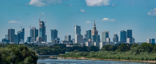
Time to put comfy sandals on!
The best time to visit the city is July and August when it’s cool enough not to break a sweat and hot enough to enjoy summer. The city, which has quite a combination of both old and modern textures, is located by the river of Vistula.
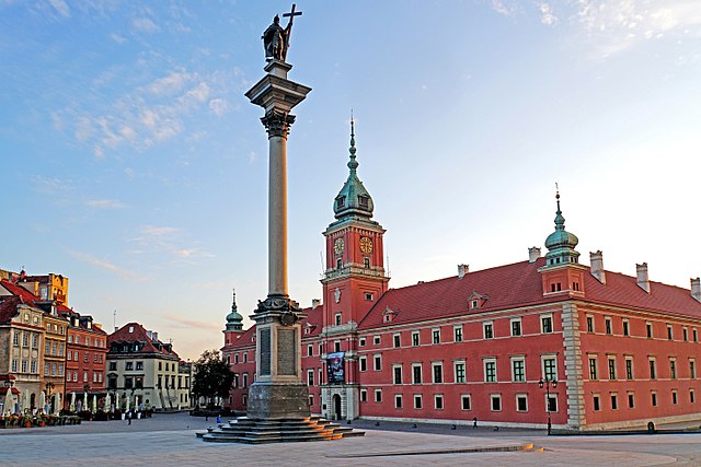
The historic
 Old Town,
reconstructed after World War II, with its late 18th-century
characteristics, is a must-see. You can start your walk from
Nowy Świat Street,
which will take you straight to the Old Town.
Old Town,
reconstructed after World War II, with its late 18th-century
characteristics, is a must-see. You can start your walk from
Nowy Świat Street,
which will take you straight to the Old Town.
Then you can go to the
Powiśle
area and take a walk on the newly renovated promenade on the riverfront. There are also lots of cafes, bars, and restaurants where you can shake off the exhaustion of the day. On
Sundays, there are many parks where you can enjoy nature or listen to pianists from around the world playing Chopin.
Photos: Wikipedia.org.
For clarity, all demos in this guide present a limited set of features. Visit the feature-rich editor example to see more in action.
The editor above does not require any configuration, using one of the following builds: classic, inline, balloon, or balloon-block, for example:
import ClassicEditor from '@ckeditor/ckeditor5-build-classic/src/ckeditor';

ClassicEditor
    .create( document.querySelector( '#editor' ) )
    .then( /* ... */ )
    .catch( /* ... */ );
# Presentational styles
Presentational styles do not relate to any special meaning of the content. They directly control the visual aspect of an image. The default available presentational styles determine the image alignment behavior. Check the list of the available semantical styles in the table below.
You should combine presentational image styles with the optional image resizing feature as these features were designed to be used together. The image width is then controlled by the image resize feature, while the alignment is controlled by the image style feature.
If you do not enable the image resize feature in your setup while using the default presentational styles, your images will always retain their original sizes (up to 100% of the editor width). The alignment may thus not be visible.
If you do not want to enable image resizing, you can use semantical styles to set the image dimensions.
The example editor below uses predefined presentational image styles represented by buttons grouped in the dropdowns according to the way the image is displayed in the document:
- Inline images – Displayed inside a line of text. It is the default style for the inline images and it does not apply any CSS class to the image.
- Images wrapped with text
 – These are the images with the CSS
 floatproperty. They can be either in the inline or block mode. To keep the HTML output valid, the block images (wrapped with the<figure>tags) can only be placed before or after paragraphs, not in the middle of them. It contains the following image styles:'align-left','align-right'.
- Images placed between the paragraphs – Block images without the CSS
floatproperty. It contains the following image styles:'align-block-left' ,
,'align-block-right' ,
,'block' – This style is the default one for block images and it does not apply any CSS class to the image.
You can change the style of an individual image using the contextual toolbar invoked after you click an image.
The example is also configured to use the image resize feature with three resize options available: 'resizeImage:original', 'resizeImage:50', and 'resizeImage:75'. They allow you to set the image width in the editor to the original image size (up to 100% of the editor window width), 50%, and 75%. You can also use the resize handles to set a custom size of the image.
See the result below:
Walking the capitals of Europe: Warsaw
If you enjoyed my previous articles in which we discussed wandering around Copenhagen and Vilnius, you’ll definitely love exploring Warsaw.
Time to put comfy sandals on!
The best time to visit the city is July and August when it’s cool enough not to break a sweat and hot enough to enjoy summer. The city, which has quite a combination of both old and modern textures, is located by the river of Vistula.
The historic
Old Town,
reconstructed after World War II, with its late 18th-century
characteristics, is a must-see. You can start your walk from
Nowy Świat Street,
which will take you straight to the Old Town.
Then you can go to the
Powiśle
area and take a walk on the newly renovated promenade on the riverfront. There are also lots of cafes, bars, and restaurants where you can shake off the exhaustion of the day. On
Sundays, there are many parks where you can enjoy nature or listen to pianists from around the world playing Chopin.
Photos: Wikipedia.org.
This set of buttons and styles is available by default in the predefined document editor build and does not require any additional customization:
import { DecoupledEditor } from '@ckeditor/ckeditor5-editor-decoupled';

DecoupledEditor.
    .create( document.querySelector( '#editor' ) )
    .then( /* ... */ )
    .catch( /* ... */ );
At the moment you cannot apply multiple styles (classes) to the image at the same time. To apply many CSS rules to the image (like a red border and a left alignment), you should probably consider using the semantical styles.
# Configuring the styles
There are three ways of defining the image styles in the editor configuration:
- Using one of the predefined default styles.
- Modifying one of the styles mentioned above. You can change the class it applies to the image, the icon, the tooltip, and the supported image type.
- Defining a completely custom image style.
Reusing (or modifying) predefined styles has the following advantage: CKEditor 5 will use its official translations provided for the defined button titles.
# Demo
The editor example below shows what you can achieve by customizing the visual representation of images and the UI for setting image styles (icons, tooltips, and dropdowns).
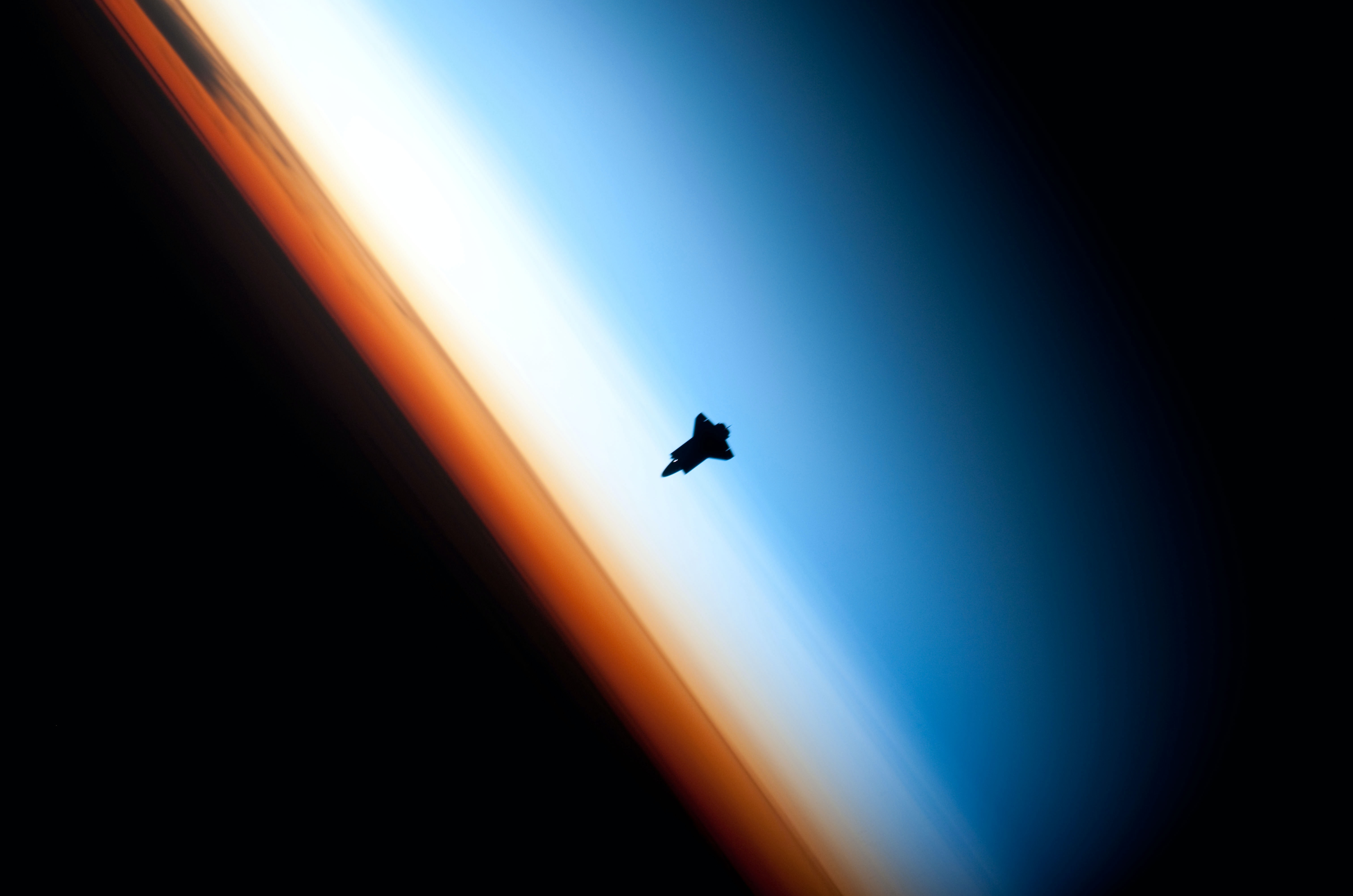
Handshake over the clouds
Rivalry is what drove early space exploration. After WW2, the two superpowers on opposite sides of the world set off on a race from the planet’s surface into the cosmic void. Most of the time, they would race against each other. But after the Soviets set up permanent space stations on Low Earth Orbit and the Americans put a man on the Moon, the time came to hold back the competition and cooperate.
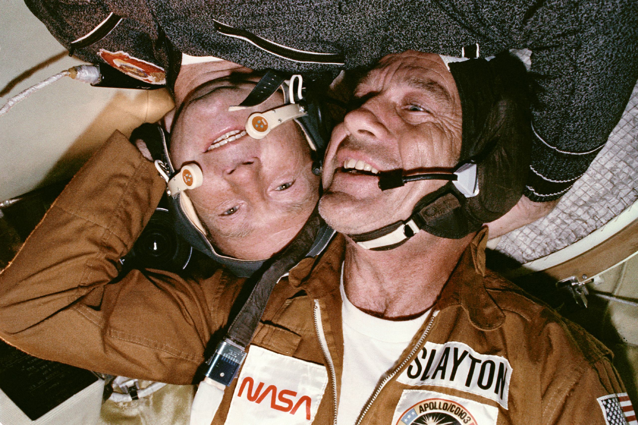
The first step on the road to building the International Space Station was the Apollo Soyuz Test Project. A redesigned pair of the Apollo and Soyuz spacecraft met in orbit and docked together in 1975. Their respective commanders, Thomas Stafford and Alexei Leonov, shook hands inside the airlock brought to orbit by Apollo. The spaceships remained docked for two days.
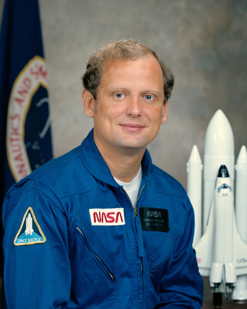
The ASTP mission was a great step forward but for a long time the only one. It also marked the end of an era, as the Apollo used for that mission was the last of its kind. Six years later the era of space shuttles began, which renewed cooperation between the once-rivals. In 1994, Russia and the USA started the Shuttle-Mir program, which saw Russians riding shuttles and Americans visiting the Mir space station, with Norman Thagard being the first US citizen to ever fly a Soyuz. This was the preliminary phase and a technology testbed before launching the first module of the International Space Station in 1998.
The next step in collaboration:
International Space Station
This editor uses custom image styles, custom image toolbar configuration with declarative dropdowns, and some modified default styles. You can find some more examples of using and modifying these styles in the config.image.styles API documentation.
ClassicEditor
    .create( document.querySelector( '#editor' ), {
        // More of editor's configuration.
        // ...
        image: {
            styles: {
                // Defining custom styling options for the images.
                options: [ {
                    name: 'side',
                    icon: sideIcon,
                    title: 'Side image',
                    className: 'image-side',
                    modelElements: [ 'imageBlock' ]
                }, {
                    name: 'margin-left',
                    icon: leftIcon,
                    title: 'Image on left margin',
                    className: 'image-margin-left',
                    modelElements: [ 'imageInline' ]
                }, {
                    name: 'margin-right',
                    icon: rightIcon,
                    title: 'Image on right margin',
                    className: 'image-margin-right',
                    modelElements: [ 'imageInline' ]
                },
                // Modifying icons and titles of the default inline and
                // block image styles to reflect its real appearance.
                {
                    name: 'inline',
                    icon: inlineIcon
                }, {
                    name: 'block',
                    title: 'Centered image',
                    icon: centerIcon
                } ]
            },
            toolbar: [ {
                // Grouping the buttons for the icon-like image styling
                // into one dropdown.
                name: 'imageStyle:icons',
                title: 'Alignment',
                items: [
                    'imageStyle:margin-left',
                    'imageStyle:margin-right',
                    'imageStyle:inline'
                ],
                defaultItem: 'imageStyle:margin-left'
            }, {
                // Grouping the buttons for the regular
                // picture-like image styling into one dropdown.
                name: 'imageStyle:pictures',
                title: 'Style',
                items: [ 'imageStyle:block', 'imageStyle:side' ],
                defaultItem: 'imageStyle:block'
            }, '|', 'toggleImageCaption', 'linkImage'
            ]
        }
    } )
    .then( /* ... */ )
    .catch( /* ... */ );
It also applies multiple CSS rules to not only display custom image styles (the 'image-margin-right', 'image-margin-left', and 'image-side' classes) properly, but also to provide the default content styles. This makes the appearance of headers, paragraphs, links, captions, and newly inserted images consistent.
The most important rules regarding the image styling are presented below. You can see the complete content style sheet here.
/* Defining the default content styles for the block images.
This is what the newly inserted image without any
style-specific class will look like. */
.ck-content .image {
    margin-top: 50px;
    margin-bottom: 50px;
}
.ck-content .image img {
    border-radius: 50%;
    width: 180px;
    height: 180px;
    object-fit: cover;
    filter: grayscale(100%) brightness(70%);
    box-shadow: 10px 10px 30px #00000078;
}
.ck-content .image::before {
    content: '';
    width: 100%;
    height: 100%;
    background-color: #1138b0;
    top: 5%;
    left: 5%;
    position: absolute;
    border-radius: 50%;
}
.ck-content .image::after {
    content: '';
    width: 200%;
    height: 200%;
    background-image: url(../../assets/img/image-context.svg);
    background-size: contain;
    background-repeat: no-repeat;
    position: absolute;
    top: -60%;
    pointer-events: none;
    left: -60%;
}

/* Defining the default content styles for the inline images.
This is what the newly inserted image without any
style-specific class will look like. */
.ck-content .image-inline {
    margin: 0 4px;
    vertical-align: middle;
    border-radius: 12px;
}
.ck-content .image-inline img {
    width: 24px;
    max-height: 24px;
    min-height: 24px;
    filter: grayscale(100%);
}

/* Defining the custom content styles for the images
placed on the side of the editing area. */
.ck-content .image.image-side {
    float: right;
    margin-right: -200px;
    margin-left: 50px;
    margin-top: -50px;
}
.ck-content .image.image-side img {
    width: 360px;
    height: 360px;
}

/* Defining the custom content styles for the images
placed on the editor margins. */
.ck-content .image-inline.image-margin-left,
.ck-content .image-inline.image-margin-right {
    position: absolute;
    margin: 0;
    top: auto;
}
.ck-content .image-inline.image-margin-left {
    left: calc( -12.5% - var(--icon-size) / 2 );
}
.ck-content .image-inline.image-margin-right {
    right: calc( -12.5% - var(--icon-size) / 2 );
}
.ck-content .image-inline.image-margin-left img,
.ck-content .image-inline.image-margin-right img {
    filter: none;
}

/* Defining the custom content styles for the image captions. */
.ck-content .image > figcaption {
    z-index: 1;
    position: absolute;
    bottom: 20px;
    left: -20px;
    font-style: italic;
    border-radius: 41px;
    background-color: #ffffffe8;
    color: #1138b0;
    padding: 5px 12px;
    font-size: 13px;
    box-shadow: 0 0 18px #1a1a1a26
}
# Ready-to-use styles
The ImageStyle plugin provides a set of default styles depending on the loaded plugins. The table below presents the availability of these styles and the image behavior caused by an application of a particular style.
| Style name | Required plugins | Converts to | Applies class | Type |
|---|---|---|---|---|
| "block" | ImageBlock |
block | removes all classes (default style) | semantical |
| "inline" | ImageInline |
inline | removes all classes (default style) | semantical |
| "side" | ImageBlock |
block | image-style-side |
semantical |
| "alignLeft" | any | - | image-style-align-left |
presentational |
| "alignRight" | any | - | image-style-align-right |
presentational |
| "alignBlockLeft" | ImageBlock |
block | image-style-align-block-left |
presentational |
| "alignBlockRight" | ImageBlock |
block | image-style-align-block-right |
presentational |
| "alignCenter" | ImageBlock |
block | image-style-align-center |
presentational |
# Installation
This feature is available in all ready-to-use editor builds. If your integration uses a custom editor build, check out the image feature installation guide to learn how to enable this feature.
# Common API
The ImageStyle plugin registers:
-
A button for each defined style, for example:
'imageStyle:block'and'imageStyle:side'(to use in the image toolbar). -
The
'imageStyle'command. It accepts a value based on theimage.stylesconfiguration option (for example,'block'and'side'):editor.execute( 'imageStyle', { value: 'side' } );
We recommend using the official CKEditor 5 inspector for development and debugging. It will give you tons of useful information about the state of the editor such as internal data structures, selection, commands, and many more.
# Contribute
The source code of the feature is available on GitHub at https://github.com/ckeditor/ckeditor5/tree/master/packages/ckeditor5-image.
Every day, we work hard to keep our documentation complete. Have you spotted outdated information? Is something missing? Please report it via our issue tracker.