

 Editor UI
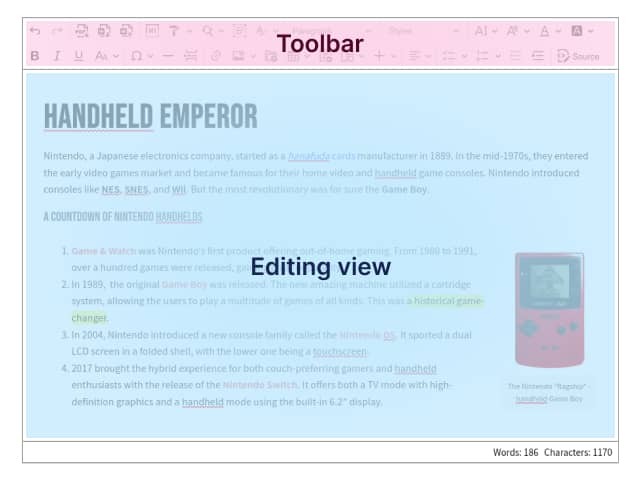
# Interface parts
In the previous chapter of this tutorial, we created a command to highlight selected text. However, having to open a console and run a command is cumbersome and definitely not what editor users want.
Let’s update the editor interface to make this easier for them.
The editor interface consists of two parts:
- toolbar with buttons, dropdowns and other elements for performing various types of operations,
- editing view for typing and modifying content.
In this section, we will focus on updating the toolbar.
# Creating a new button
Let’s import the ButtonView constructor in the src/plugin.js file:
import { ButtonView } from 'ckeditor5/src/ui';
Then add the following code at the bottom of the Highlight method:
editor.ui.componentFactory.add( 'highlight', ( locale ) => {
    const button = new ButtonView( locale );
    const command = editor.commands.get( 'highlight' );
    const t = editor.t;

    button.set( {
        label: t( 'Highlight' ),
        withText: true,
        tooltip: true,
        isToggleable: true
    } );

    button.on( 'execute', () => {
        editor.execute( 'highlight' );
        editor.editing.view.focus();
    } );

    button.bind( 'isOn', 'isEnabled' ).to( command, 'value', 'isEnabled' );

    return button;
} );
The editor’s UI elements are registered using the componentFactory, where the first parameter is the name of the element and the second is the callback that returns that element.
In the callback we do four things:
- Create a button and set a few properties on it, one of which is the translated text created with the
editor.t()method. - Register a callback that will execute the
highlightcommand and put the focus back to the editing view when the button is pressed. - Bind the
isOnandisEnabledbutton properties to thevalueandisEnabledcommand properties. This ensures that the button is only clickable when the command can be executed, and that it is active when the selection is already highlighted. - Return the configured button.
# Registering a new button
When we go back to the browser, we see that nothing has changed. The button we just created is not there.
This is because to see the button, we need to register it in the editor’s configuration. To do this, add the 'highlight' string (the name we passed as the first argument to the editor.ui.componentFactory.add() method) to the toolbar.items array.
Open src/main.js and update the configuration of the editor:
const editor = await ClassicEditor.create( element, {
    plugins: [
        Essentials,
        Paragraph,
        Highlight
    ],
    toolbar: {
        items: [
            'undo',
            'redo',
            'highlight' // Add this line.
        ]
    }
} );
When you refresh the page, the button should be there.
# Testing changes
Let’s test our changes. In the browser, select some text in the editor and click the highlight button in the toolbar.
If all went well, the text you selected should be highlighted in the editor and the button should be active. If you click the button again, the selection should be removed and the button should no longer be active.
# What’s next
Congratulations, you have just finished this tutorial!
If you want to read more about the editor’s UI, see the UI library document.
Otherwise, go to the next chapter, where you will learn more about events and observables and better understand the bind(...).to(...) mechanism we used to make the button reactive.
Every day, we work hard to keep our documentation complete. Have you spotted outdated information? Is something missing? Please report it via our issue tracker.